A five-year creative partnership with the Delaware Valley's most distinctive literary festival — producing identity, posters, print, and digital across five editions in Narrowsburg, NY.
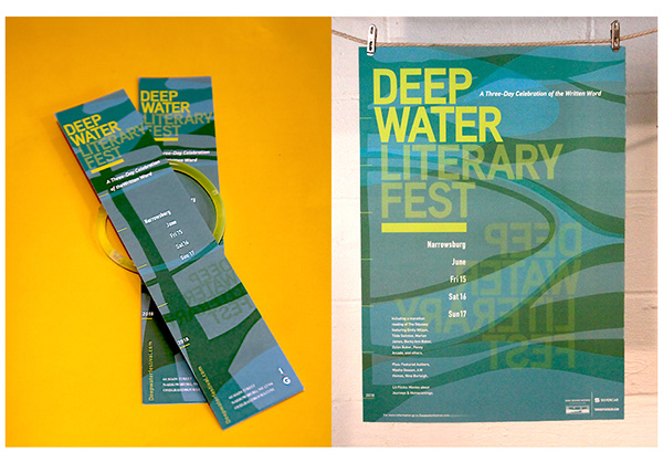
The Deep Water identity is built on a foundation of commanding display typography and a flexible colour system that shifts boldly between editions — carrying the festival's spirit while allowing each year to feel distinct.
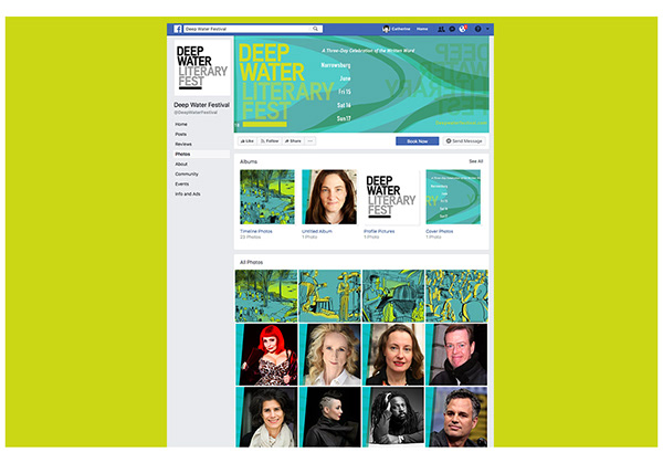
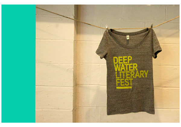
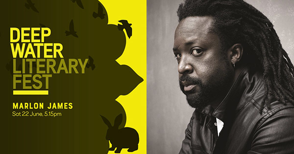
The logotype — stacked, heavy, and direct — anchors every application from A2 posters to Instagram stories, t-shirts to festival programmes. A mark strong enough to hold the festival's ambition.
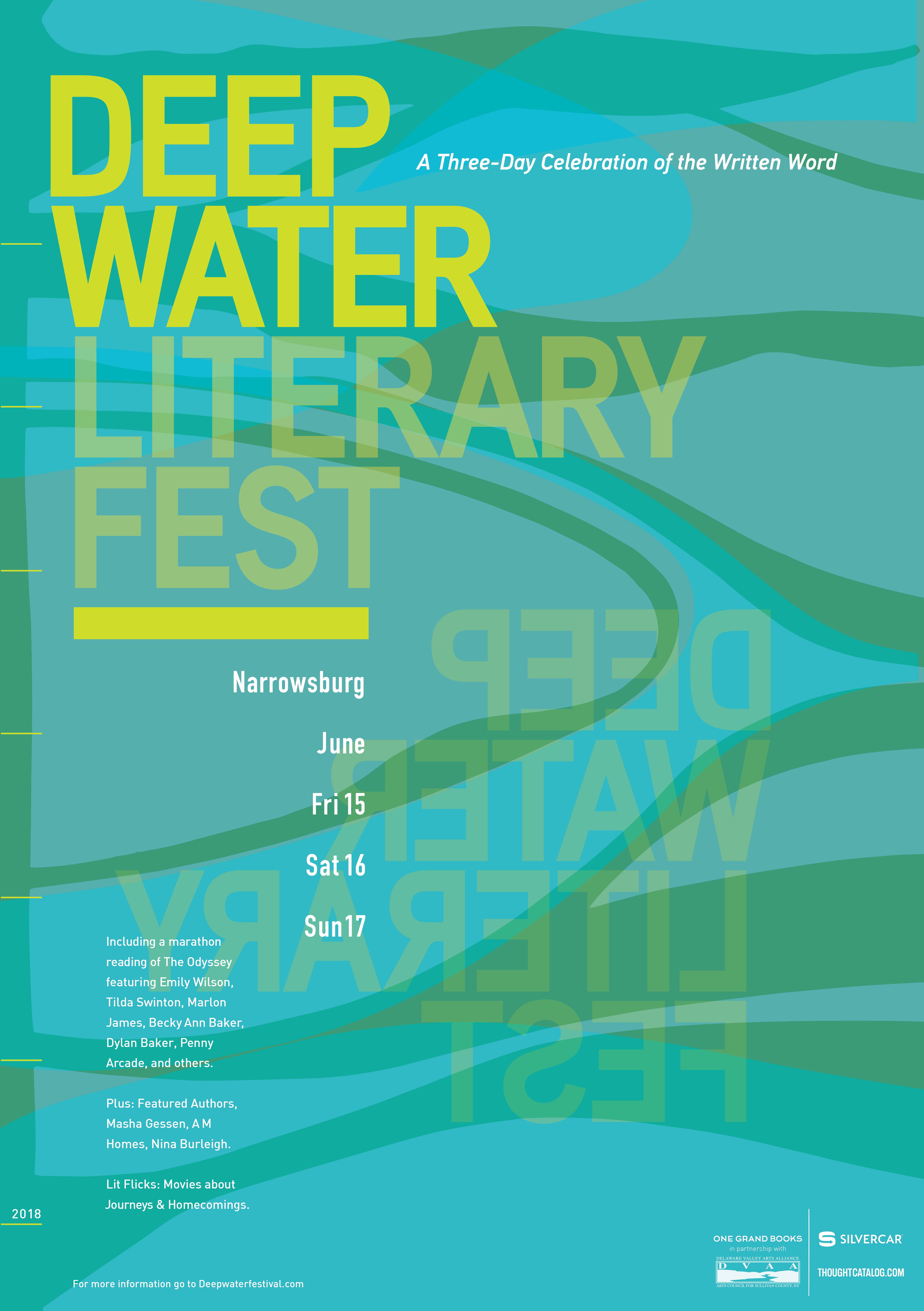
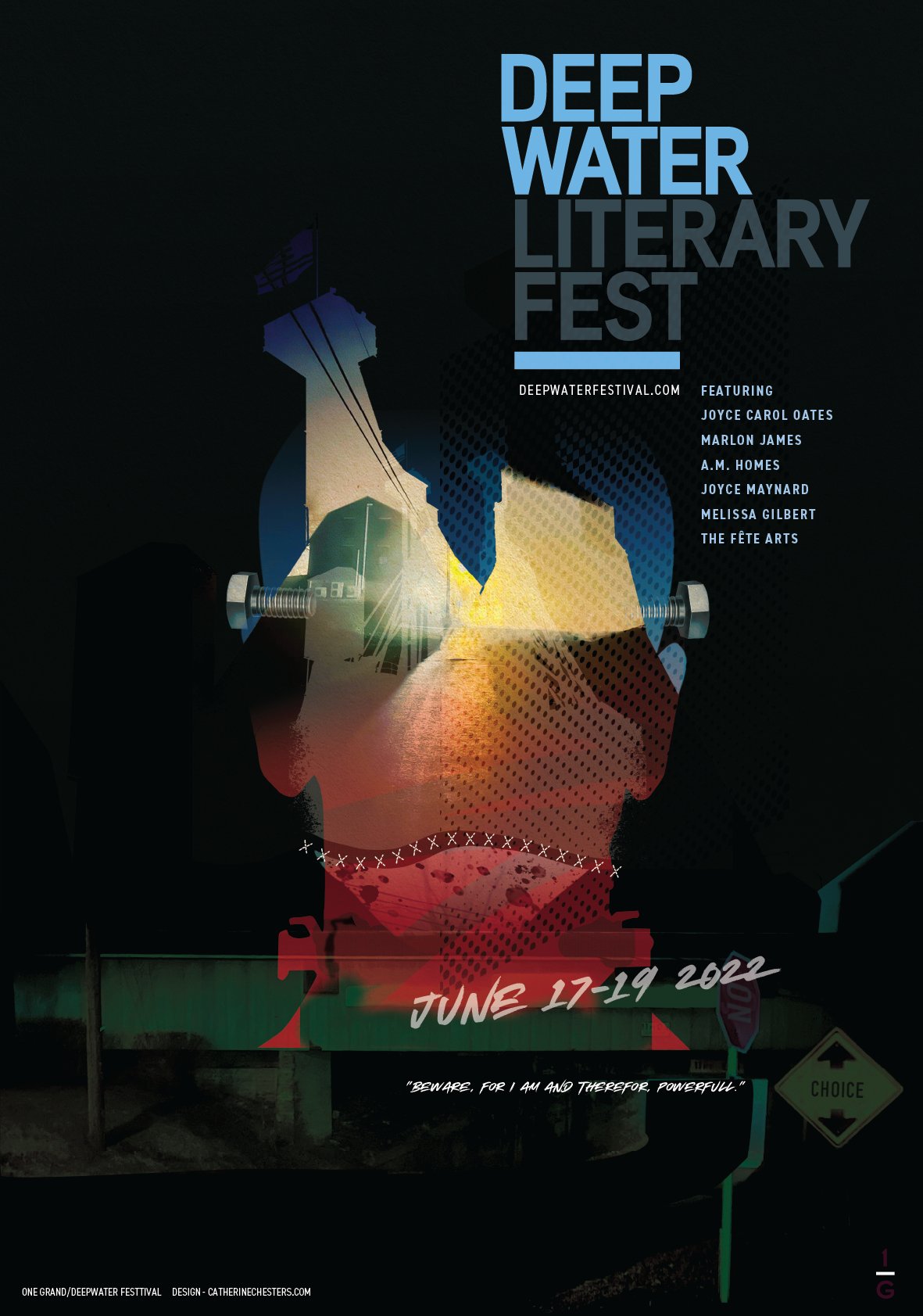
Each edition finds its own palette — a system that stays bold across five years and five distinct visual worlds.
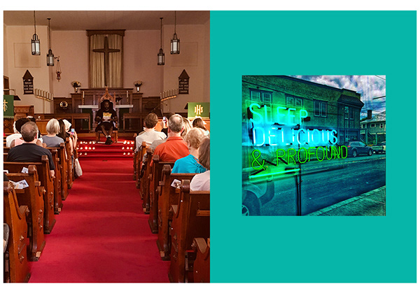
The Deep Water Literary Festival is something genuinely special — a free, community-rooted celebration of writing and storytelling in the small river town of Narrowsburg, NY, drawing world-class authors, actors, and artists to the Delaware Valley every summer.
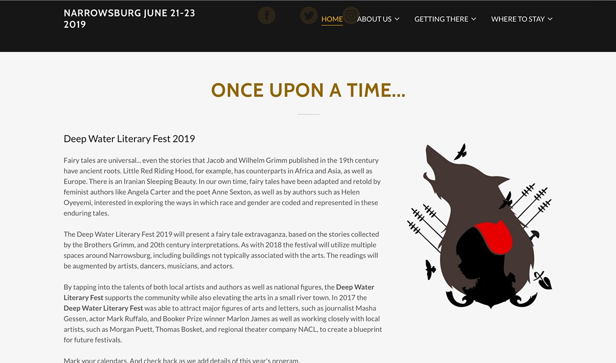
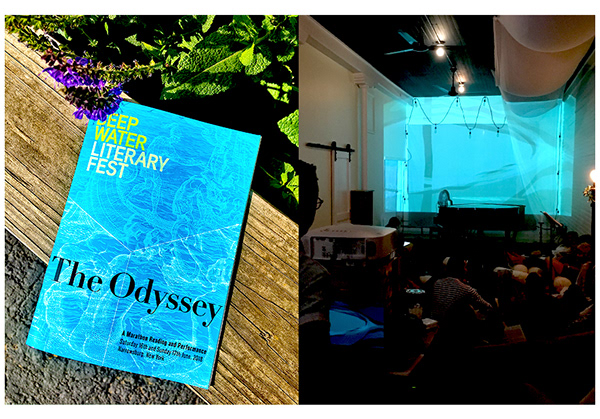
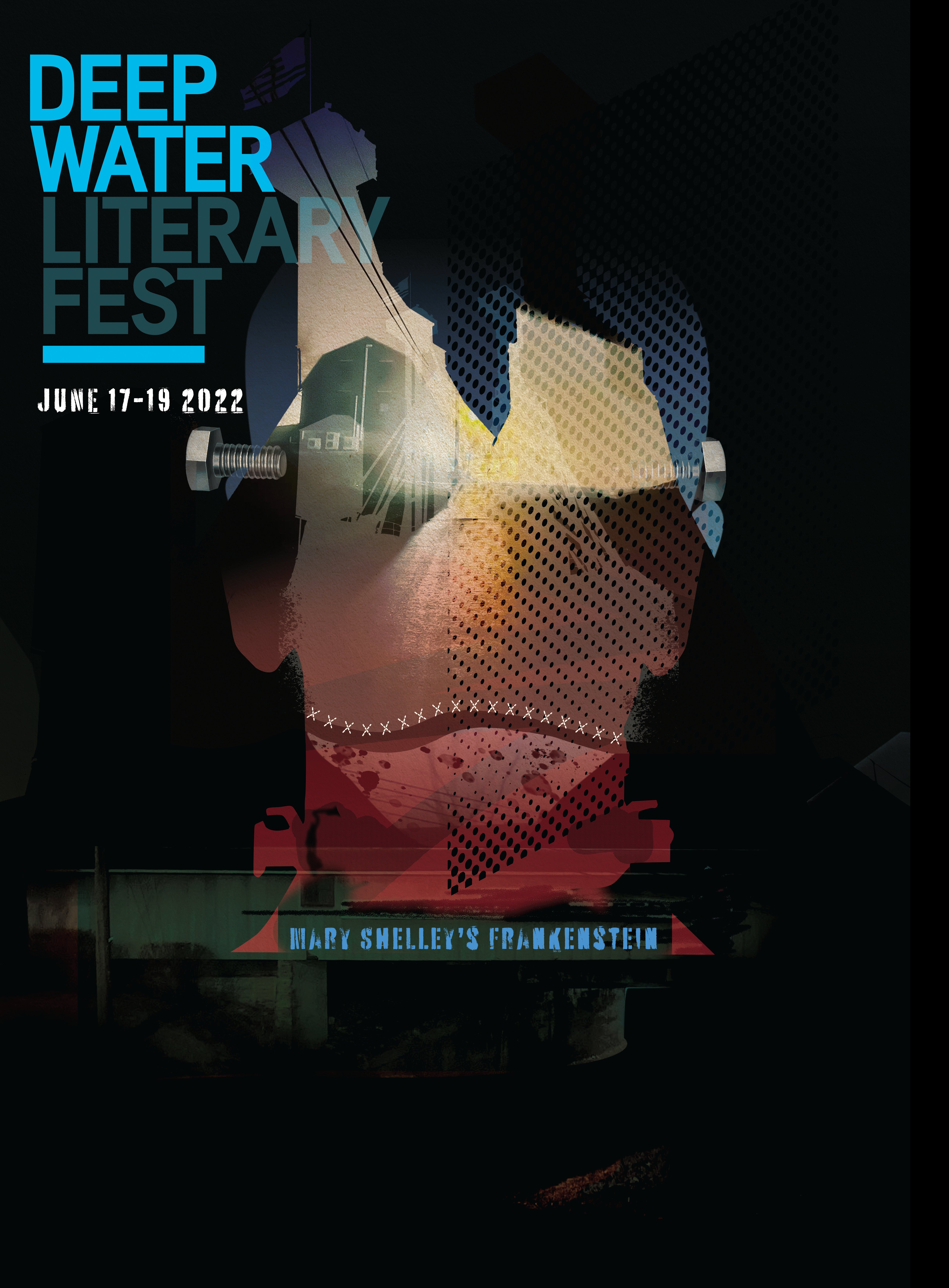
Over five editions, I developed a graphic identity that holds across years while reinventing itself each cycle — a bold typographic core flexible enough to absorb entirely different themes, from The Odyssey to Grimm's Fairy Tales to Mary Shelley's Frankenstein.
Each year demanded a full print suite — A2 posters, booklets, social media, digital banners — produced on tight timelines and shoestring festival budgets, without ever compromising on ambition or impact.
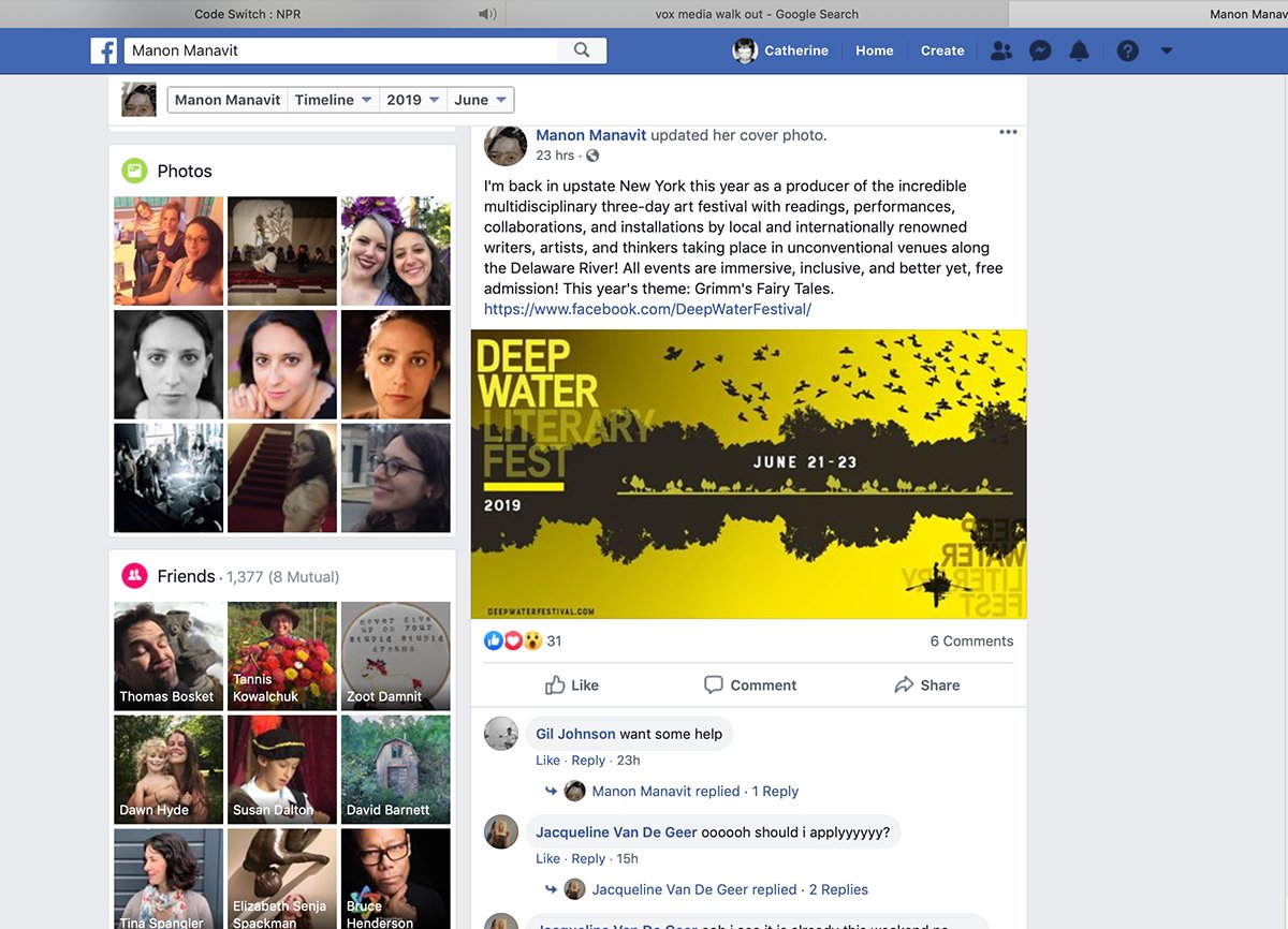
A multidisciplinary three-day art festival with readings, performances, collaborations, and installations by local and internationally renowned writers, artists, and thinkers — in unconventional venues along the Delaware River.